Looking for fresh poster ideas to ignite your creativity? I know the challenge of staring at a blank canvas, waiting for that spark of inspiration. Some of the best ideas for poster idea drawing come from staying in tune with current graphic design trends, from bold color schemes to striking typography. Whether you’re aiming for visual impact, thematic unity, or just want to play with unique layouts, there’s so much to explore.
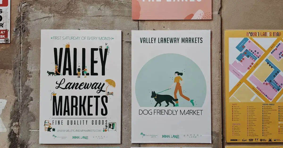
Inspiration for poster drawing can come from unexpected places. Adding movement and rhythm to your designs – like Annik Troxler’s dynamic work for the Jazz Festival Willisau – can give your posters a vibrant edge. Try using rotated circles or geometric shapes to infuse your design with energy and flow.

At first, I will give you a lot of inspiration for your next poster ideas drawing – then I will write a little bit about the fundamentals of designing a poster.
Motifs for Poster Ideas Drawing
Nature and Environment Posters
- Forest Conservation Awareness: A detailed drawing of a serene forest to promote conservation efforts and raise awareness about deforestation.
- Marine Life Protection: An underwater scene to highlight the importance of protecting marine ecosystems and endangered species.
- Mountain Adventure Promotion: A majestic mountain range to inspire outdoor adventures and promote eco-friendly tourism.
- Wildlife Sanctuary Fundraiser: Various animals in their natural habitat to support wildlife sanctuaries and animal protection programs.
- Eco-friendly Living: A picturesque sunset over a field to promote sustainable living practices and renewable energy sources.

Inspirational Quotes Posters
- Office Motivation: Bold, elegant typography of an inspirational quote to boost employee morale and productivity.
- Personal Growth: Hand-drawn calligraphy of a motivational quote to encourage personal development and self-improvement.
- Educational Inspiration: A famous quote with small illustrative elements to inspire students and educators.
- Creative Workspace: A quote written in a chalkboard style to enhance a creative and artistic workspace environment.
- Wellness and Mindfulness: An inspirational quote over a soft, blended watercolor background to promote mental well-being and mindfulness.

Educational Posters
- Chemistry Classroom: A colorful and informative periodic table to aid in teaching and learning chemical elements.
- History Exhibit: A visual timeline of significant historical events to engage and educate visitors at a museum or educational institution.
- Biology Lab: Detailed drawings of the human body to assist in understanding human anatomy for students and healthcare professionals.
- Geography Lesson: An educational world map to teach geography and cultural diversity in classrooms.
- Astronomy Club: A poster of the solar system to inspire interest in space exploration and astronomy.

Movie and TV Show Posters
- Film Festival Promotion: Iconic scenes from classic movies to advertise a local film festival.
- Fantasy Fan Event: Posters featuring characters and scenes from fantasy films to promote a fan convention or event.
- Comic Book Store: Dynamic drawings of popular superheroes to attract customers to a comic book store.
- Animation Celebration: Beloved animated characters to celebrate the anniversary of a famous animated film or series.
- TV Show Viewing Party: Iconic moments from popular TV shows to decorate for a themed viewing party or event.
Music and Concert Posters
- Band Tour Announcement: Drawings of famous bands or musicians to promote an upcoming concert tour.
- Album Release: Creative reinterpretations of classic album covers to celebrate a new album release.
- Music Festival Promotion: Posters for an imaginary music festival to attract attendees and generate excitement.
- Lyrics Art Show: Illustrations inspired by lyrics to feature in an art show dedicated to music and lyrics.
- Instrument Lessons: Detailed drawings of musical instruments to advertise music lessons or workshops.
Sports Posters
- Sports Event Promotion: Dynamic drawings of athletes in action to advertise an upcoming sports event or tournament.
- Hall of Fame Tribute: Portraits of legendary athletes to honor their achievements in a sports hall of fame.
- Team Spirit Boost: Posters celebrating a sports team to boost team spirit and support among fans and players.
- Stadium Decoration: Illustrations of famous sports stadiums to decorate the interiors of sports venues.
- Extreme Sports Awareness: Posters showcasing extreme sports to promote safety awareness and highlight the excitement of these activities.
Fantasy and Sci-Fi Posters
- Sci-Fi Convention: Imaginative drawings of alien planets to promote a science fiction convention.
- Fantasy Novel Release: Scenes of epic battles to advertise the release of a new fantasy novel.
- Futuristic Exhibit: Illustrations of futuristic cityscapes for a technology and innovation exhibit.
- Magic Show Promotion: Posters featuring wizards and magical creatures to attract audiences to a magic show.
- Space Exploration Program: Drawings of spacecraft and astronauts to inspire interest in space programs and STEM education.
Travel and Adventure Posters
- Tourism Campaign: Drawings of famous landmarks to promote travel and tourism to various destinations.
- Vacation Package: Illustrations of beautiful travel destinations to advertise vacation packages.
- Adventure Sports Promotion: Posters showcasing adventure activities to attract thrill-seekers and adventure enthusiasts.
- Travel History Exhibit: Retro-style travel posters for an exhibit on the history of travel and transportation.
- Cultural Festival: Creative maps highlighting different regions to promote a cultural festival celebrating global diversity.
Food and Drink Posters
- Restaurant Menu Board: Illustrations of gourmet dishes to create an attractive menu board for a restaurant.
- Cocktail Party Invitation: Posters featuring popular cocktail recipes to invite guests to a cocktail party or mixology class.
- Food Truck Rally: Fun drawings of food trucks to promote a local food truck rally or festival.
- Cooking Class Advertisement: Detailed drawings of culinary tools to advertise cooking classes and workshops.
- Farmers’ Market Promotion: Vibrant illustrations of fresh produce to attract visitors to a farmers’ market.

Abstract and Geometric Posters
- Modern Art Exhibit: Posters with intricate geometric patterns to promote a modern art exhibit.
- Office Decor: Abstract designs using color gradients to enhance the aesthetic of office spaces.
- Minimalist Home Decor: Minimalist line art with abstract forms for home decoration purposes.
- Optical Illusion Display: Posters with optical illusions to create an interactive display in a science museum or art gallery.
- Contemporary Art Sale: Contemporary abstract art to attract buyers to an art sale or gallery opening.

Cute Posters
- Animal Tea Party: A delightful scene of cute animals like rabbits, bears, and foxes having a tea party in a forest clearing.
- Dream Big: An inspiring image of a little bear cub reaching for the stars, with whimsical clouds and twinkling stars surrounding it.
- Friendly Veggies: Smiling vegetables like carrots, peas, and tomatoes holding hands in a garden setting, with the slogan “Eat Your Veggies!”
- Love Grows Here: A cute scene of potted plants with happy faces, growing in a row with hearts blooming from their leaves.
- Happy Rainy Day: A joyful illustration of a child in a raincoat jumping in puddles with a smiling umbrella and playful raindrops.

Step-by-Step-Tutorial To Create an Music Show Poster
Step 1: Define Your Poster Concept
- Determine the Style and Theme:
- Think about the type of music show (rock, jazz, classical, hip-hop) and decide on a style that reflects it.
- Decide on the mood you want to convey—energetic, moody, vintage, or modern.
- Key Information to Include:
- Band/Artist Name
- Date and Time
- Venue Location
- Ticket Price and Purchasing Information
- Supporting Acts (if any)
Step 2: Gather Your Materials
- Paper or Poster Board: Use high-quality, thick paper (such as Bristol board or heavy cardstock) that can handle multiple mediums.
- Pencils: For sketching. Have a range of hardness (HB for light sketches, 2B or 4B for darker lines).
- Erasers: Regular and kneaded erasers for correcting mistakes and lightening areas.
- Pens: Fine-tip pens for outlining (0.1mm to 0.5mm). Consider using waterproof pens if you’ll use markers or watercolors.
- Markers: Alcohol-based or water-based markers for vibrant colors. Use different shades for depth.
- Colored Pencils: For finer details and adding soft color gradients.
- Ruler and Compass: For precise lines, borders, and circular elements.
- Reference Images: Photos of the band, instruments, or related imagery that inspire your design.
Step 3: Plan Your Layout
- Brainstorm Layout Ideas:
- On a separate sheet, create small, rough sketches (thumbnail sketches) to experiment with different layouts.
- Consider where the title, main image, and text information will be placed for balance and readability.
- Select Your Final Layout:
- Choose the layout that best suits the music show’s theme and is clear and eye-catching.
Step 4: Sketch the Poster
- Light Pencil Sketch:
- Lightly sketch the main elements on your final paper. Start with the largest elements like the title and main imagery.
- Sketch in the event details (date, time, venue) in designated areas.
- Ensure your composition is balanced, with no overcrowded or empty areas.
- Adjust As Needed:
- Check for spacing and alignment, making adjustments as necessary before moving on to inking.
Step 5: Ink the Outline
- Outline the Title:
- Use a pen to carefully ink the band or artist’s name. Consider adding stylistic touches like shadows or outlines to make it stand out.
- Outline the Main Image:
- Go over your main drawing with a fine-tip pen. Vary the line thickness to add depth—thicker lines for the outer edges, thinner lines for details.
- Ink the Event Details:
- Outline all text information, ensuring that it’s easy to read. Use consistent lettering styles that match the poster’s theme.
- Add Borders and Decorative Lines:
- If your design includes borders or dividers, carefully ink these as well. A ruler can help keep lines straight.
Step 6: Add Shading and Depth
- Pencil Shading:
- Use pencils to add shading and texture to your drawing. Cross-hatching or stippling (small dots) can be effective for creating shadows and depth.
- Pen Shading:
- Enhance shadows and details with fine pen strokes. Add more texture to elements like fabric, hair, or background details.
Step 7: Color the Poster
- Choose Your Colors:
- Pick a color scheme that reflects the music show’s vibe. Limit your palette to 3-5 main colors for a cohesive look.
- Apply Base Colors:
- Start with the larger areas and apply the base colors using markers. Work from light to dark to avoid muddying the colors.
- Layer and Blend:
- Use markers or colored pencils to add layers and gradients. For instance, add darker shades for shadows and lighter tones for highlights.
- Details and Highlights:
- Add finer details with colored pencils. You can also use a white pen or pencil for highlights that make certain elements pop.
Step 8: Final Touches
- Check for Balance:
- Step back and view your poster from a distance. Ensure the key information is clear and the design is visually appealing.
- Enhance Text Readability:
- If any text isn’t standing out, consider adding a drop shadow, outline, or background color to make it more readable.
- Fix Any Mistakes:
- Use your eraser to clean up any pencil lines still showing or correct any small mistakes.
Step 9: Prepare for Display
- Let It Dry:
- Allow the poster to dry completely if you’ve used ink or markers, especially if you plan to handle it.
- Consider Protection:
- If the poster will be displayed for a long time, consider spraying it with a fixative to protect it from smudging or fading.
- Mounting (Optional):
- For added durability, you can mount the poster on a piece of foam board or another sturdy backing.
Step 10: Display and Share
- Physical Display:
- Hang the poster in high-traffic areas like music venues, cafes, or community boards to attract attention.
- Photograph for Online Sharing:
- Take a high-quality photo of your poster and share it on social media or the event’s website to reach a wider audience.
Fundamentals of Poster Designing
The Purpose of Posters
Posters serve various purposes, including event promotion, product advertising, and information dissemination. What I find most fascinating is their ability to capture an audience’s attention swiftly. They need to be eye-catching to stand out in busy environments. Thus, clear and concise communication is crucial. Posters should provoke curiosity, provide necessary information, and encourage action, whether it’s attending an event or purchasing a product.
Key Design Elements
Design elements lay the groundwork for any poster. Contrast, repetition, alignment, and proximity are essential for creating a coherent and engaging layout. Contrast helps important information stand out, while repetition creates a unified look. Alignment organizes content into a structured layout, and proximity groups related elements together. These principles not only make the poster visually appealing but also guide the viewer’s eye through the information logically. Colors play a critical role here, as color theory can influence emotions and attention.
Visual Hierarchy and Balance
Visual hierarchy is all about leading the viewer’s eye to the most critical information first, like event dates or key messages. Using different font sizes, colors, and image placements can create a visual path that makes the poster easy to read. Balance refers to the distribution of visual weight in the design. Whether using symmetrical or asymmetrical layouts, balance ensures the poster doesn’t feel lopsided or chaotic. Proper balance keeps the viewer engaged without overwhelming them.
Typography and its Impact
Typography is more than choosing a pretty font; it’s about readability and conveying the tone of the message. Serif fonts often appear formal, while sans-serif fonts feel more modern and clean. The size, spacing, and color of the typography affect how easily your message can be read from a distance. Bold headings can grab attention, while smaller, consistent text provides the details. Good typography harmonizes with other design elements to ensure the poster is both attractive and functional.
To create great Fonts, you can use these Poster Markers.
Creating a Strong Call-to-Action
A strong call-to-action (CTA) is essential for engaging your audience. Whether you’re promoting an event, a product, or a service, your CTA should be clear and compelling. Words like “Join Now,” “Discover More,” or “Get Started” often work well.
Place the CTA prominently. I recommend positioning it where it naturally draws the eye, such as the center or the bottom of the poster.
Combining bold colors and contrasting backgrounds can help make your CTA stand out even more. Remember, it should be the focal point that guides the audience on the next steps, so make sure it stands out visually.
Incorporating Branding Consistently
Consistent branding reinforces your identity and makes your poster easily recognizable. Stick to your brand guidelines to maintain a cohesive look. This includes using your brand’s colors, logos, and fonts throughout the poster.
I always ensure that the brand elements align with the overall design. For example, if your brand palette includes blue and green, keep to those colors for text, borders, and backgrounds.
Incorporate storytelling elements to make the poster more engaging. Share your brand’s story subtly through images, taglines, or quotes that resonate with your audience. This creates a strong connection and enhances the effectiveness of your communication.
What are some creative approaches to drawing a poster?
One creative approach is to use mixed media. Combining pencils, ink, and watercolor can add depth and interest.
Another technique is to incorporate unique typography and doodles to frame your main subject, making it more engaging.
Can you suggest some simple drawing ideas for a school poster competition?
Draw a vibrant scene from a beloved book or film, emphasizing key characters and settings. Alternatively, create a poster with positive messages, using bright colors and motivational quotes for a cheerful design.
How can I make my poster drawing stand out and look amazing?
Use contrasting colors to make elements pop. Incorporate large, bold images and keep text minimal but striking. Consider layering different textures to add visual interest and depth to your poster.
What topics work best for creating an engaging poster?
Popular topics include environmental awareness, celebrating cultural events, or promoting school spirit. Topics that resonate with the audience, like social causes or upcoming events, are always engaging.
What are some tips for making a poster eye-catching and appealing?
Use high-contrast color schemes. Highlight essential information with larger fonts and use icons or illustrations to break up text. Balance your layout by leaving some negative space to avoid clutter.
How do you draw a beautiful and easy poster for beginners?
Start with a simple sketch. Outline your main elements clearly. Use basic shapes and vibrant colors to create an appealing design. Add small details gradually but ensure the main message remains clear and visible.
If you’re ready to transform your concepts into visual masterpieces, diving into resources like Venngage’s creative poster ideas or Canva’s poster design techniques can provide a solid foundation. These platforms offer a blend of templates and expert tips that can help elevate your design game and ensure your posters stand out.
If you liked my blog post about poster ideas drawing, don’t forget to leave me a comment down below to tell me about your experience with it.
You can also follow me on Pinterest for more drawing ideas!


